Our Brand
The Simplot Company Brand has grown over time, anchored first by J.R. himself, and now by the family members, company leaders and employees who have helped build the Company into the global food and agriculture organization we have today. Every time we represent Simplot, we are reinforcing and impacting the Simplot Brand.
In the Brand Guidelines, we provide an in-depth explanation of the Simplot Brand and information about how we can collectively manage it while allowing room for each business area to represent its unique attributes. Together, we are ambassadors of the Simplot Brand and through our collaborative approach, we can maintain a clear image of the brand image to the world.
-
Logos
-
Color
-
Typography
-
Photography
BRAND
Logo
Our logo is the primary visual graphic for our brand. It is composed of two elements: the Simplot logotype and the leaf symbol.
The Simplot logotype is based on a customized typeface that has been representing the Company for many years. The warm gray coloring references our past with its earthy tones, but also points to the future with its clean, modern look.
The leaf symbol is similarly rooted in our heritage, inspired by the blossom of a potato plant. Its glowing gold tones indicates our belief in the potential of agriculture and food to transform the future.
Primary 3D Logo
The primary logo uses Simplot Gray and Simplot Gold with a 3D effect on the leaf and is approved for use on white or light colors and images as long as the image is open and clear (e.g., clouds or a white wall).
Primary Flat Version
Use a flat version of the full-color logo where the Gold leaf doesn’t use a 3D effect in situations where the 3D effect isn’t preferred (e.g., at less than 3” (7.6 cm) wide or for embroidery).
White/Gold 3D (Reversed) Logo
This version is approved for use over dark colors and images as long as the image area is open and clear (e.g., blue sky or a green field). The White/Gold 3D version incorporates the leaf effect and is preferred over the flat version to the right.
White/Gold Flat (Reversed) Logo
A flat version of the White/Gold logo is available for dark colors and images or at smaller sizes (e.g., at less than 2” (5.1cm) wide) where the 3D leaf will not render well.
All-White Logo
Use the all-white version against dark colors and images when cost or other considerations prohibit use of the full-color logo.
All-Black Logo
Use the all-black version on light-to-medium colors and images when cost or other considerations prohibit use of the full-color logo.
BRAND
The Simplot Leaf
The leaf symbol plays a critical role in our brand aesthetic. It highlights our history and our connection to farming and potatoes. It also expresses our belief in a bright future and the role agriculture will play in helping us create that future.
The leaf must also have the correct clear space around it. The leaf includes a trademark TM symbol* of appropriate size for most uses. Depending on the size of the leaf, you may need to enlarge or shrink the TM to keep it legible. The TM is not required if the leaf appears .75” (1.3 cm) or smaller.
If you are using the leaf more than once on the same page, it must have a trademark symbol the first time it appears. The mark should also appear with the first use on separate pages or sections of the same materials.
THE LEAF CAN’T APPEAR WITHOUT THE SIMPLOT LOGO
The leaf is NOT an alternative for the Simplot logo. The full Simplot logo must always be present somewhere in the same material.
3D Leaf
Flat Simplot Gold Leaf
Simplot Gold Outline
Simplot Gray Solid
Simplot Gray Outline
Black Solid
Black Outline
White Solid
White Outline
Color Palette
Primary colors are the colors we want to use frequently to accent our primary brand colors. That doesn’t mean they need to be used constantly, but they should be consistently present to build an association with our brand.
PRIMARY COLOR
Simplot Gold
PMS - 7406
CMYK - 0/17/100/0
RGB - 241/196/0
HEX - #F1C400
PRIMARY COLOR
Dark Simplot Gold- - -
PMS - 118
CMYK - 7/28/100/30
RGB - 172/132/0
HEX - #AC8400
PRIMARY COLOR
Medium Simplot Gold
PMS - 110
CMYK - 2/22/100/8
RGB - 218/170/0
HEX - #DAAA00
PRIMARY COLOR
Light Simplot Gold
PMS - 1215
CMYK - 0/6/53/0
RGB - 251/216/114
HEX - #FBD872
PRIMARY COLOR
Simplot Gray
PMS - Pantone Warm Gray 11
CMYK - 26/36/38/68
RGB - 110/98/89
HEX - #6E6259
PRIMARY COLOR
Black- - - - - - - - - - -
PMS - Black- - -
CMYK - 60/40/40/100
RGB - 0/0/0- - - -
HEX - #000000
PRIMARY COLOR
Medium Simplot Gray
PMS - Cool Gray 11
CMYK - 0/0/0/80- - - -
RGB - 88/89/91
HEX - #58595B
PRIMARY COLOR
Light Simplot Gray
PMS - Warm Gray 7
CMYK - 16/23/23/44
RGB - 150/140/131
HEX - #968C83
PRIMARY COLOR
Field Green
PMS - 363
CMYK - 76/3/100/18
RGB - 54/131/33
HEX - #368321
PRIMARY COLOR
Dark Field Green
PMS - 350
CMYK - 80/21/79/64
RGB - 44/82/52
HEX - #2C5234
PRIMARY COLOR
Med Field Green
PMS - 2273
CMYK - 84/0/100/39
RGB - 37/114/38
HEX - #257226
PRIMARY COLOR
Light Field Green
PMS - 368
CMYK - 65/0/100/0
RGB - 120/190/32
HEX - #78BE20
Secondary Color Palette
Secondary colors are the colors we want to use frequently to accent our primary brand colors. That doesn’t mean they need to be used constantly, but they should be consistently present to build an association with our brand.
SECONDARY COLOR
Sky
PMS - 288
CMYK - 100/80/6/32
RGB - 0/45/114
HEX - #002D72
SECONDARY COLOR
Dark Sky
PMS - 322
CMYK - 97/9/39/34
RGB - 0/116/112
HEX - #007470
SECONDARY COLOR
Bright Sky- - -
PMS - 3135
CMYK - 100/0/20/0
RGB - 0/176/202
HEX - #00B0CA
SECONDARY COLOR
Blood Orange
PMS - 484
CMYK - 8/92/100/33
RGB - 130/39/4
HEX - #822704
SECONDARY COLOR
Rust Orange
PMS - 167
CMYK - 5/77/100/15
RGB - 189/79/25
HEX - #BD4F19
Typography
As with our color palette, we selected the following typography to best represent our brand. Chosen for their versatility and ease of use, these fonts are legible, approachable and timeless, while providing a forward-thinking style. They should be used in all situations companywide.
Our brand uses Cairo for headlines and for subheadings.
Our brand uses Inter for body text.
A secondary font if the standard Inter is kerned too wide for your application.
Where Can I find Cairo and Inter Fonts?
Your Simplot-issued computer may come with Cairo and Inter already installed. If you need them, simply search “brand fonts” on the Simplot DAM, and download and install them to your computer. If you need help installing them, reach out to the IT Service Desk.
External customer and agencies can go to fonts.google.com to download Cairo and Inter fonts for free.
Photography
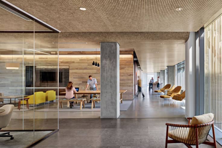
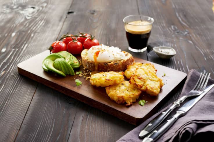
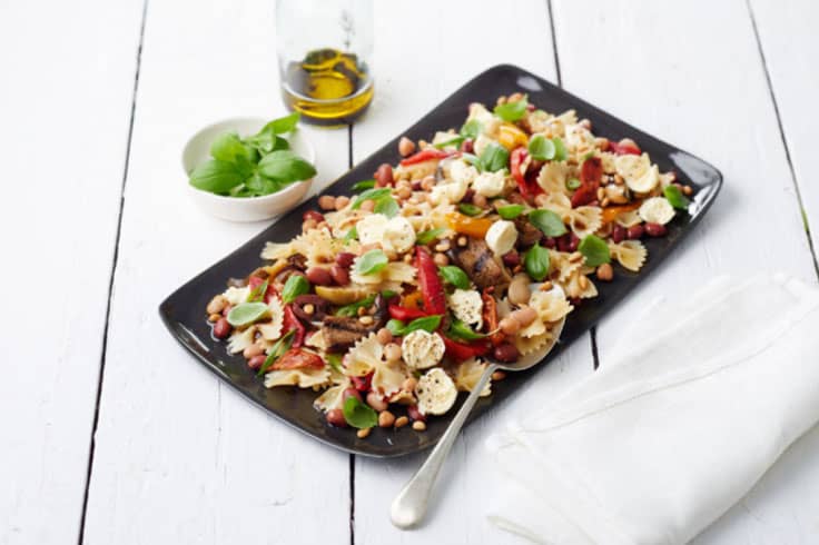
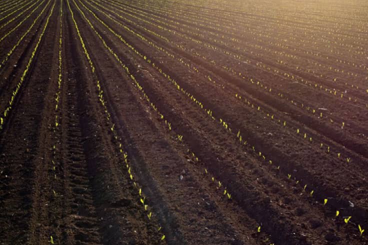
Our brand images help us connect with our customers, our partners, our prospects and the broader public. It helps set us apart from our competitors and allows us to share our unique and optimistic point of view with the world.
Our brand images have a few things in common:
- We come from authentic farming roots, so don’t use fake, overly-styled images with actors. Choose stock photographs that use real people, not posed models.
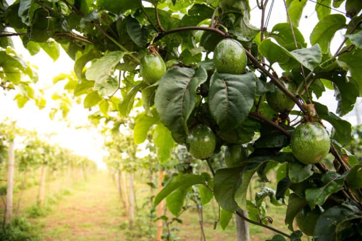
- We express our positive attitude and our belief in the beauty of what’s possible through use of abundant natural light — particularly the special atmosphere that the sun’s glow, shine or flare creates in our images.
- We like to draw the viewer into our brand experience by telling a story. Engage our audience and inspire curiosity through subject matter, angle, cropping and other native effects.


